Improving the Donation Experience

I worked with ShelterBox to improve the online donation experience, making the journey simpler, clearer and more engaging for people wanting to support the charity.
I traced the full donation process to understand where effort, uncertainty or distraction appeared.
I focused on moments most likely to interrupt intent before a donation was completed.
I reduced unnecessary decisions and made the next action clearer at each stage.
I restructured the experience quickly before committing time to detailed visual design.
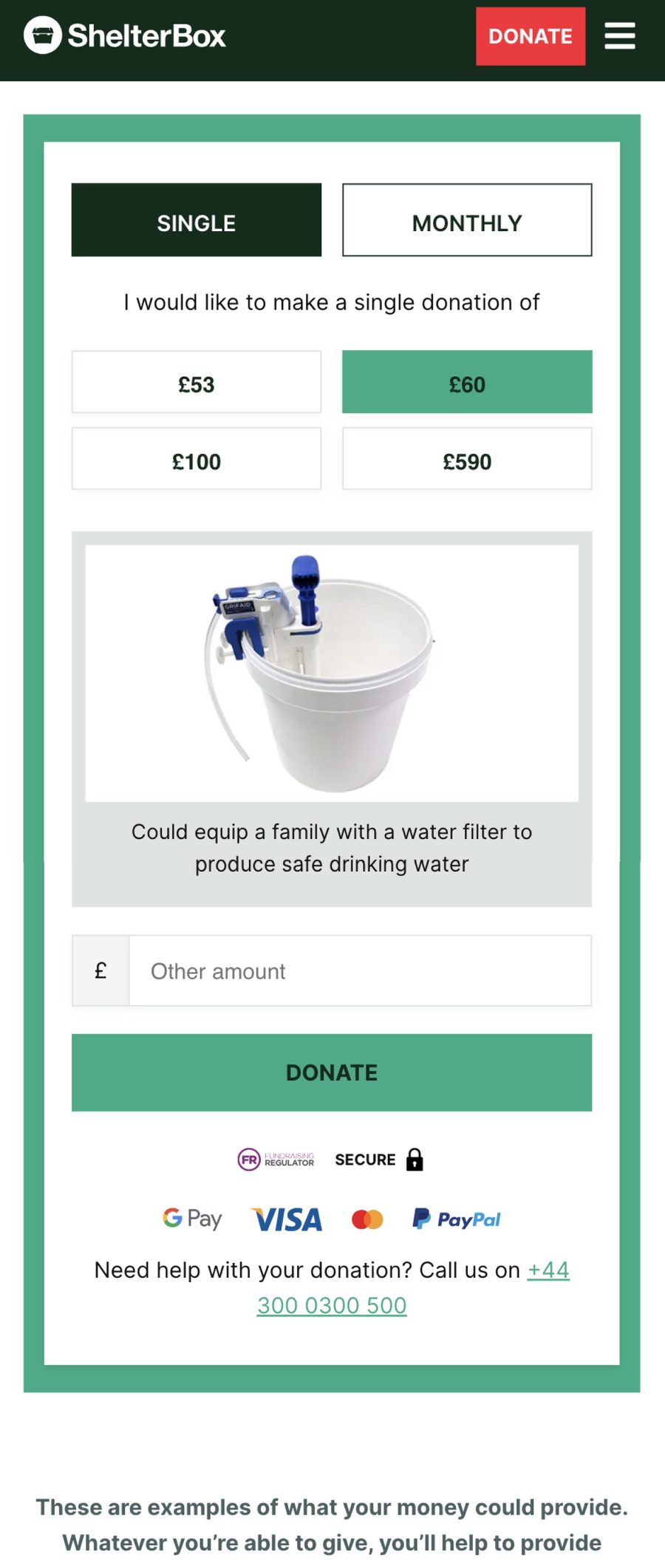
I improved forms, choices and donation elements so the interface felt easier to use.
I introduced stronger visual storytelling to maintain emotional connection through the journey.
I showed tangible examples of what contributions could provide, giving donation amounts clearer meaning.
I demonstrated the revised flow end to end so interactions could be reviewed before build.
I refined the experience with ShelterBox around both user needs and fundraising goals.
ShelterBox is an international charity that provides emergency shelter and essential items to people affected by disaster and conflict. The existing donation journey was creating friction, with some users abandoning the process before completing their donation.
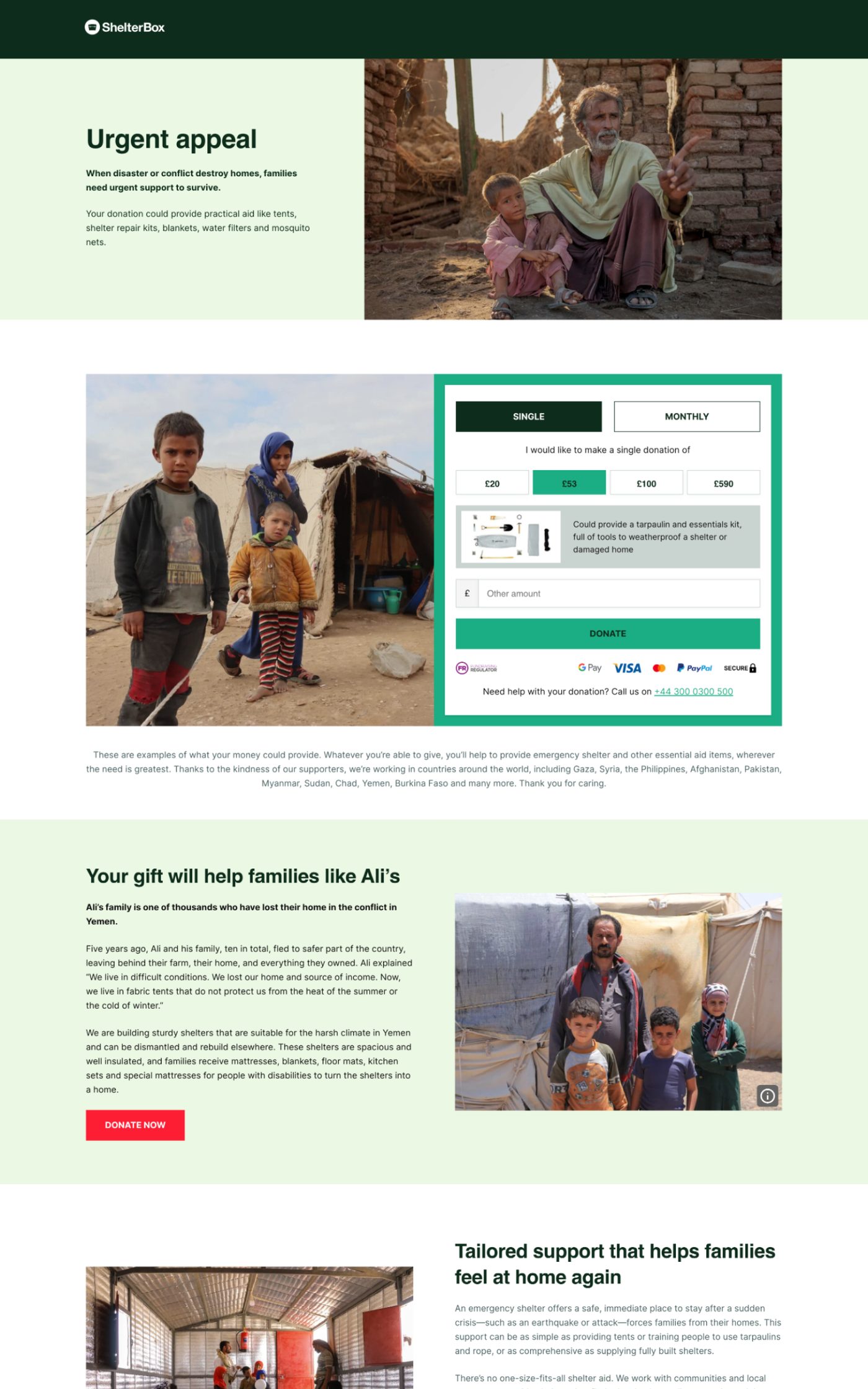
I created a more fluid and engaging donation experience, using imagery to show users what their contribution could help provide. This gave donations more context and made the impact of giving much easier to understand. The client was extremely happy with the new experience, which helped create a clearer journey from initial donation through to completion.