Unifying a Multi-Site Industrial Platform

I worked closely with Rubix to continuously improve the user journeys and overall experience across its websites.
I traced how users moved through the different Rubix sites and where the experience became inconsistent.
I compared menu structures across three websites to pinpoint conflicting patterns and labels.
I documented cross-site routes so switching between services could feel like one connected ecosystem.
I introduced a shared structure that made orientation consistent without rebuilding each website.
I added persistent top-level tabs so users could move between Rubix sites without losing context.
I simplified store access by asking for country first, then routing users to the right local shop.
I tested the proposed navigation and shopping flows before they were implemented.
I worked iteratively with Rubix, refining improvements around real operational constraints.
Rubix operates across multiple industrial supply websites. Although the websites were connected as part of the wider business, each had a different navigation structure, making it difficult for users to move between them consistently.
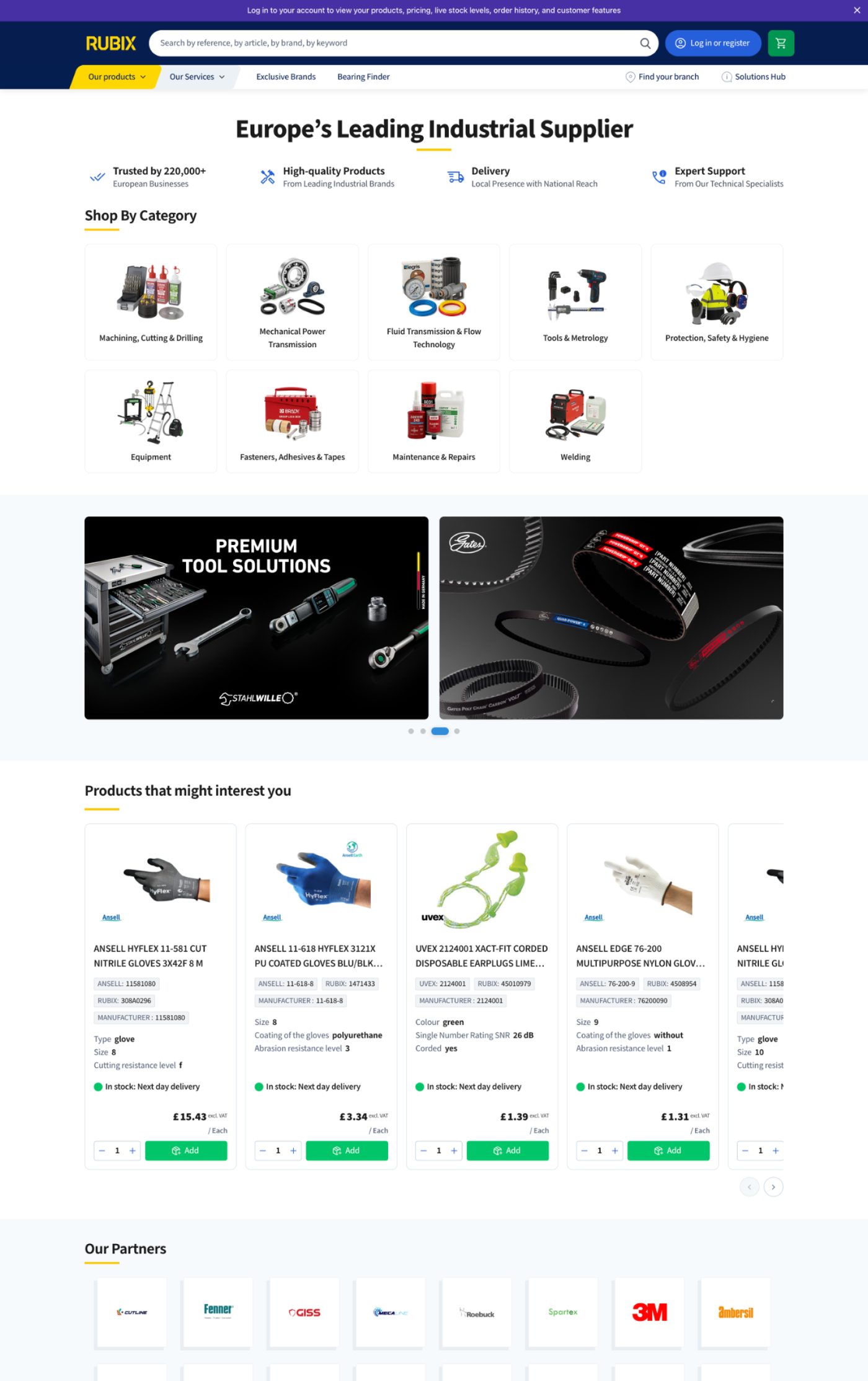
I created a new navigation system using tabs at the top of the websites, allowing users to move seamlessly between each site without feeling as though they were entering a completely different platform. I also redesigned the Shop Online journey, allowing users to select their country first before being directed to the correct local online store. The result was a clearer and more consistent experience across the Rubix digital ecosystem.